Nikki and I sat down and went through a bunch of improvements and features to prioritize for the next couple of months. And here's how it went.
So we currently have one of our engineers working part-time on Goosly. I mentioned in the prior episode we have Marketplace productivity apps, which make us money right now. There are five apps for Jira, quite decently sized in terms of UI business logic and scope. And we have a total of 4 engineers to support across 5 Jira apps and Goosly. So it is safe to say time is scarce. For this reason, we planned work for two months of a part-time engineer.
We looked at prioritizing features that would fit best with the product's main value: planning in public, communicating, and keeping your audience in the loop with your plans. But we also took in scope some features to make sure to improve the user experience with the tool. Some essential stuff is currently missing, like search functionality, better content editing, and others.
So here's the plan breakdown, you can find this and explore it yourself by navigating to our public plan.

Right, so here are the first two upcoming major features that will give you the flexibility you need when planning and communicating with your audience and teams.
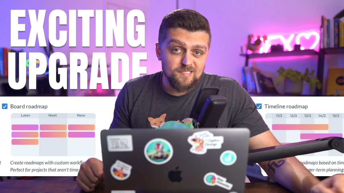
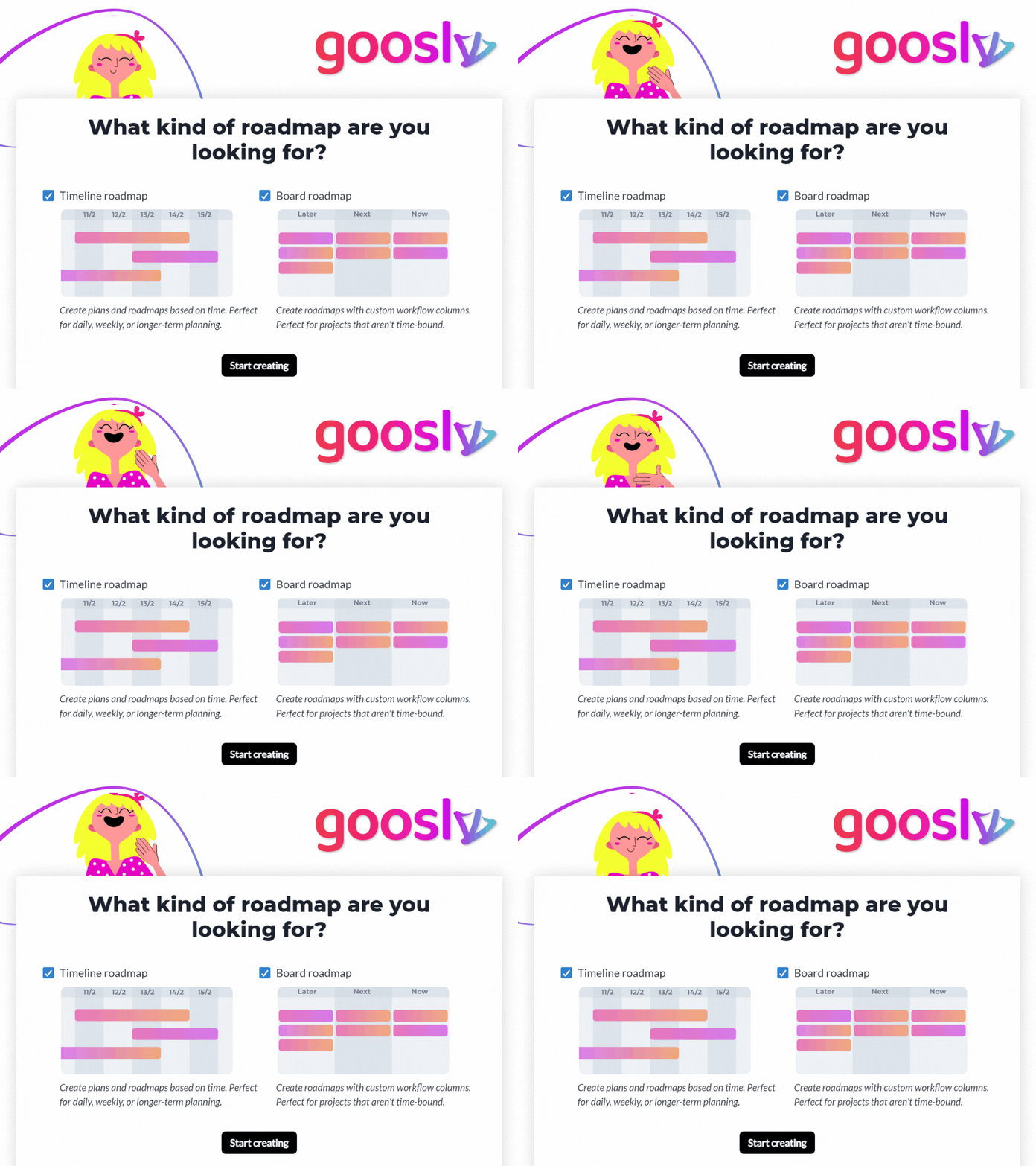
First, we have added a new roadmap type, which is not time-bound.
So when you create a new roadmap, you will see this new popup that allows you to add a roadmap with a custom column instead time axis. You could of course run both roadmaps at the same time.
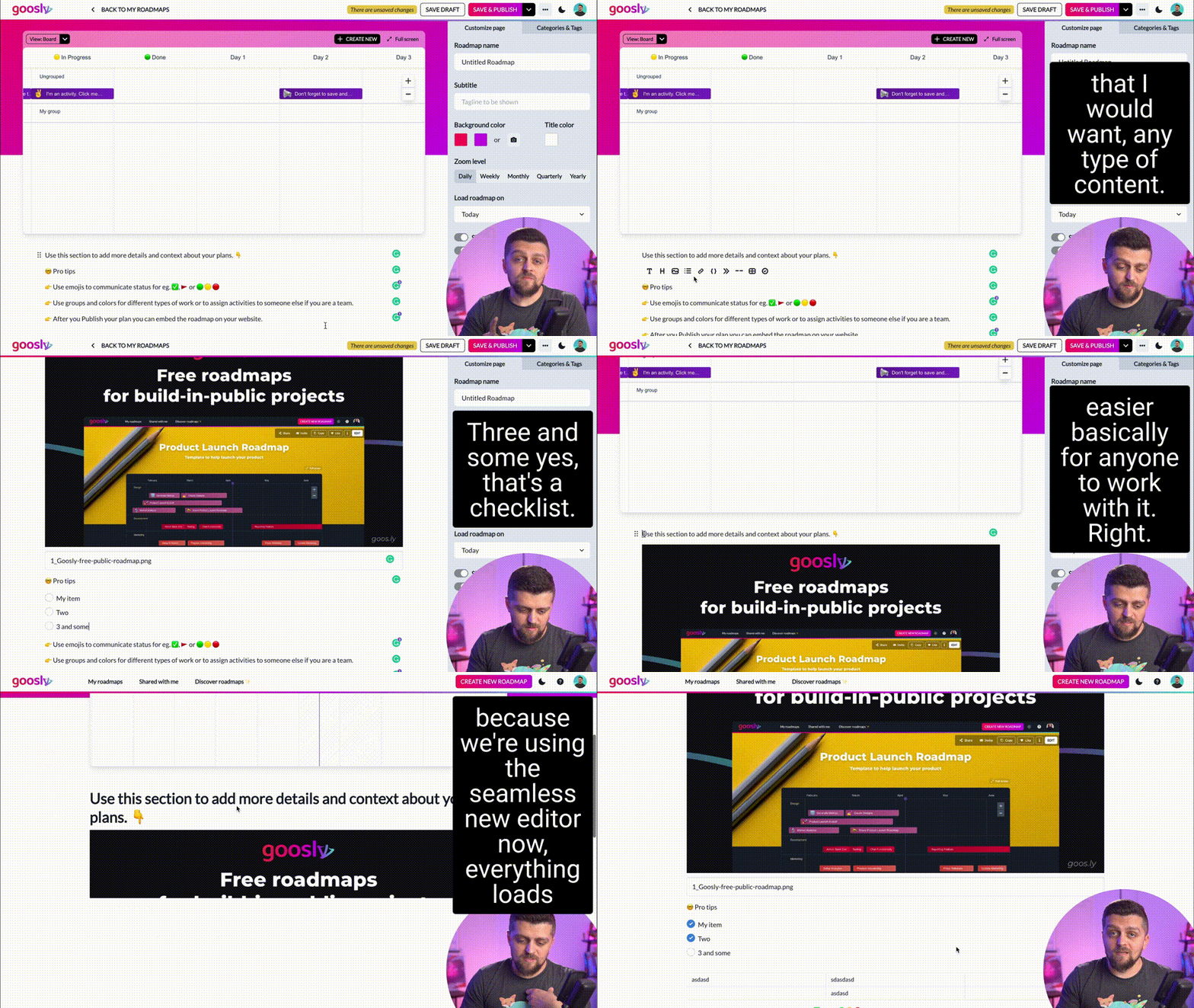
Given we added more configuration elements to the side panel we decided to move the content editor where it belongs and makes the most sense, under the roadmap. But that's not all! We're also completely replacing the clunky editing experience with a seamless in-line content builder with better content components and cleaner formatting.
So yeah, these are two major upgrades meant to help make Goosly a lot more flexible for you and your teams and make the whole experience of drafting plans and writing comms as pleasant as possible.

